Making a Strong Impression Through Digital Content
Trade shows are more than just busy halls and handshakes—they’re full of quick decisions and first impressions. A digital brochure can be the difference between catching someone’s attention and getting lost in the crowd. It’s not just about looking good on a screen, but about giving people something useful, something they’ll actually open again after they leave your booth.
The real value of a digital brochure lies in how well it communicates. Whether it’s showing off product features, sharing a brand story, or listing contact details, every part needs to do its job clearly and fast. Attendees don’t carry much; they want quick reads that offer value and help them make choices later.
Instead of handing out stacks of paper, offering a digital version shows thoughtfulness and makes your booth more approachable. It tells visitors you respect their time—and their baggage allowance.
Choosing the Right Format for Easy Access
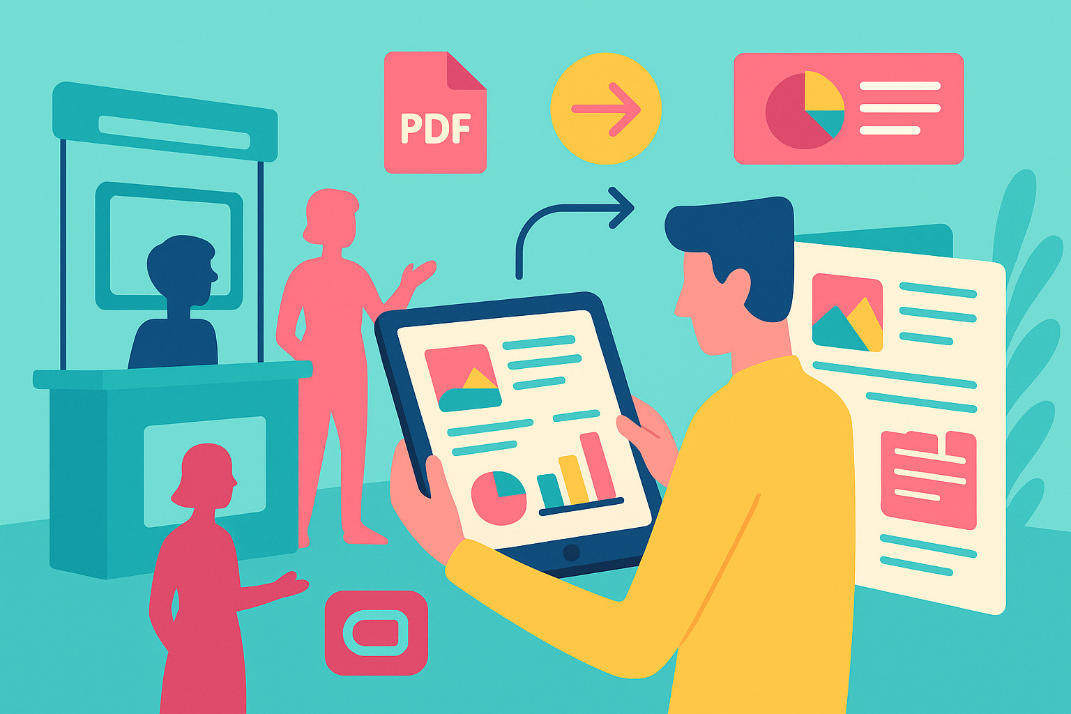
One of the first things to decide is the format. PDFs are still popular, but they’re not the only choice. Flipbooks, scrollable HTML files, or interactive mobile-friendly links are rising fast because they’re easier to use on phones and tablets.
Imagine a visitor opening your brochure during a coffee break. If the file takes too long to load or doesn’t fit their screen, you’ve likely lost them. But if it opens smoothly and feels easy to scroll through, you’ve just made a good impression without saying a word.
Keep in mind where your audience will view the content. At trade shows, many people use their phones. That means the design and layout should feel smooth on smaller screens, not crammed or hard to read.
Keeping the Design Clean and Focused
With so many booths and handouts, it’s easy for digital content to blend in. That’s why a clean design helps. It doesn’t just look nice—it helps people understand what you’re saying faster. Too many colors or moving parts can distract from the message.
The design should support the content, not compete with it. Leave plenty of white space and use consistent fonts and colors. Make sure each section of the brochure feels like it belongs with the others. This kind of balance builds trust and makes your material easier to scan.
Think of your brochure like a good conversation. It doesn’t shout, doesn’t overwhelm, but says what needs to be said in a way that’s easy to follow and leaves a good feeling behind.
Writing with Clarity and Purpose
Words matter, especially when time is short. Trade show visitors won’t read large paragraphs or sift through technical jargon. Keep it simple. Use short sentences that sound like real speech. Avoid buzzwords. Instead, focus on clear value and next steps.
A good approach is to imagine explaining your product to someone during an elevator ride. What would you say to make them curious, informed, and ready to learn more? That’s the tone that works in digital brochures too.
Always guide the reader toward an action. That could be visiting your site, watching a video, or booking a demo. Make the next step easy to see and simple to follow. A button or short link placed in the right spot can make a big difference.
Including Only What Matters Most
There’s a temptation to put everything in. All the features. All the benefits. All the history. But less is usually better. Trade show brochures should give just enough to spark interest, not enough to overwhelm. Pick the highlights that show what makes your offer different.
Too much detail can slow people down. A long brochure is harder to finish, especially when someone is standing or walking. Short sections, well-placed headlines, and quick stats or quotes help move things along.
Think of the brochure as an invitation, not a manual. Give enough to start a conversation or lead someone to click on your link. You can always share deeper materials later, once they’ve shown interest.
Using Visuals to Strengthen the Message
Photos, charts, or short animations can do a lot of heavy lifting. A good image can show what a thousand words might explain. But like anything else, visuals should have a purpose. Don’t use stock images just to fill space. Choose visuals that explain, support, or make people feel something real.
For example, a simple diagram showing how your service works can be much more effective than a paragraph of explanation. Or a real customer photo using your product can say more than a polished, empty-looking picture.
Make sure everything is clear and sharp, even on small screens. Nothing frustrates a reader more than blurry graphics or images that won’t load. Keep file sizes light and formats optimized for mobile-friendliness, ensuring your brochure performs well across a variety of devices.
Adding Interactive Elements That Make Sense
Interactivity can turn a regular brochure into something memorable. That doesn’t mean flashy effects or over-the-top features. Instead, think of small touches that help people engage—like tapping a product to see details, or clicking to watch a quick demo.
These elements help visitors explore at their own pace. They also give you a way to connect without being pushy. For instance, a contact form or link to schedule a meeting can be built right into the content.
The key is to keep things smooth. If something slows down the experience or gets in the way, it hurts more than it helps. Each feature should work fast and feel natural.
Creating a Version That’s Easy to Share
A good digital brochure shouldn’t just live at your booth. Make it easy to share—by email, text, QR code, or social media. The easier it is to pass along, the more people will see it after the event ends.
Use clear file names and short, branded links. Avoid heavy attachments that won’t open on certain phones or emails that go straight to spam. Cloud-hosted files or web-based brochures are often the safest route.
Think about how it will feel for someone opening the brochure a week later. If they like what they see and can easily send it to their teammate or manager, you’ve already extended the value of your trade show efforts.
Connecting Your Brochure to the Bigger Picture
Digital brochures work best when they fit into a bigger strategy. That might mean linking them to your landing pages, tracking who opened them, or syncing them with follow-up emails after the event.
This doesn’t have to be high-tech. Even a simple link that tracks views can give your team helpful data. Or a landing page where people can download the brochure in exchange for an email address helps grow your contacts.
The goal is not just to hand out brochures, but to start conversations. When your content fits into your trade show plan—before, during, and after the event—it helps build momentum beyond the booth.
Keeping It Simple, Always
At the heart of any strong brochure is simplicity. The clearer the content, the better it performs. The easier it is to open, read, and understand, the more it connects with people. And the more helpful it feels, the more likely it is to be remembered.
Trade shows are fast and noisy. Attendees are moving quickly, often juggling bags and business cards. A digital brochure that respects their time stands out, not by being louder, but by being easier.
In the end, brochures that work are those that make someone think, “This feels useful. I want to know more.” That’s the kind of reaction that leads to real follow-ups—and lasting relationships.